Credit Depletion Warning Experiments and Top-Up Conversion in AI Products
Low-balance warnings convert best when they offer relief, not just alarm.

Credit depletion warnings are one of the highest-leverage conversion moments in an AI product, yet most teams treat them as an afterthought. Credit systems are built to produce exactly this moment. Most teams build the warning as a notification, a simple statement of fact about a remaining number, rather than as a purchase trigger meant to resolve a decision the customer is already primed to make. That gap has a cost: a warning that raises alarm without offering relief pushes the customer toward the exit instead of the checkout page, speeding up the churn it was meant to prevent.
Opaque credit mechanics and depletion anxiety before the warning fires
The shape of the credit unit itself steers how customers behave long before any warning appears on screen. The trouble sits in what amounts to a double conversion: customers first turn dollars into credits at the moment of purchase, a step that's visible and stable, and then turn credits into actual tasks at the moment of use, a step that is variable, set by the vendor, and often hard to predict. It's the second conversion that decides what the customer actually got for their money.
Windsurf's experience before it retired its flat credit-rate model in March 2026 shows one version of this failure: charging the same number of credits for a quick question as for a complex task taught users to fear asking small questions and to cram several requests into a single prompt just to avoid waste, warping normal use of the product. Each case erodes the same thing: the customer's sense that credits map to value received, and that erosion happens well before any warning ever displays a number.
So when a low-balance warning lands after just a single weekend of normal use, it feels like punishment rather than help, and a customer who feels punished isn't in a buying mood. Billing systems that model those variables explicitly and show customers a traceable, transparent rate, which is one of the things platforms like Flexprice are built to do, turn a low-balance moment from something that feels arbitrary into something the customer can anticipate and plan around.
The Cursor repricing episode and trust as a conversion precondition
Trust in the credit unit itself is a requirement for any top-up warning to convert. A low-balance prompt at that point doesn't read as a nudge. It reads as proof the customer was right to be suspicious.
Salesforce's Agentforce tells a different story. Adding Flex Credits at $0.10 per discrete action in May 2025, alongside the original $2-per-conversation model, which stayed in place as an option, gave buyers a second way to pay that read as more predictable, not less. Repricing itself isn't the problem. Billing infrastructure that treats pricing as something that can change without breaking existing customer contracts or quietly repricing balances already purchased protects the trust that any later warning depends on.
Top-up conversion at low traffic
The real first job of a first top-up conversion test, given sample sizes too small to say anything statistically meaningful, is to find out whether the funnel is broken. 2anki.net's live credit-pack experiment, a $5 pack for 250 credits launched on September 16, 2026, shows exactly this playing out. As of September 22, 2026: 54 badge impressions over seven days, 4 clicks, 3 checkout sessions (two real prospects and one internal test), and zero completions. By September 28, 2026, twelve days live: 84 badge impressions, still 4 clicks, still 3 checkout sessions, still zero completions. A copy fix shipped on September 22 produced no new sessions.
The team's own read of the data was direct: two real prospects is statistical noise, and the actual leak in the funnel sits before checkout, at the badge itself, where only 4 clicks came out of 84 impressions, none of which reached Stripe even after the copy change. The team set a gate before drawing conclusions: wait until 15 real checkout sessions or October 20, 2026, whichever comes first, a clear acknowledgment that conversion rate simply can't be measured below that threshold. The team also flagged three UX problems as real regardless of sample size: an abstract credit unit, unaddressed subscription fear, and a weak call to action. For context, the same checkout system converted 62 paid pass sessions and 25 paid subscriptions in the same window, confirming that checkout itself works fine and that the credit pack's funnel is the specific thing failing.
The three flaws 2anki's team identified aren't specific to their product. You should watch impression-to-click and click-to-checkout rates early, not the conversion rate itself.
The three UX failures that kill top-up conversion before the customer reaches payment
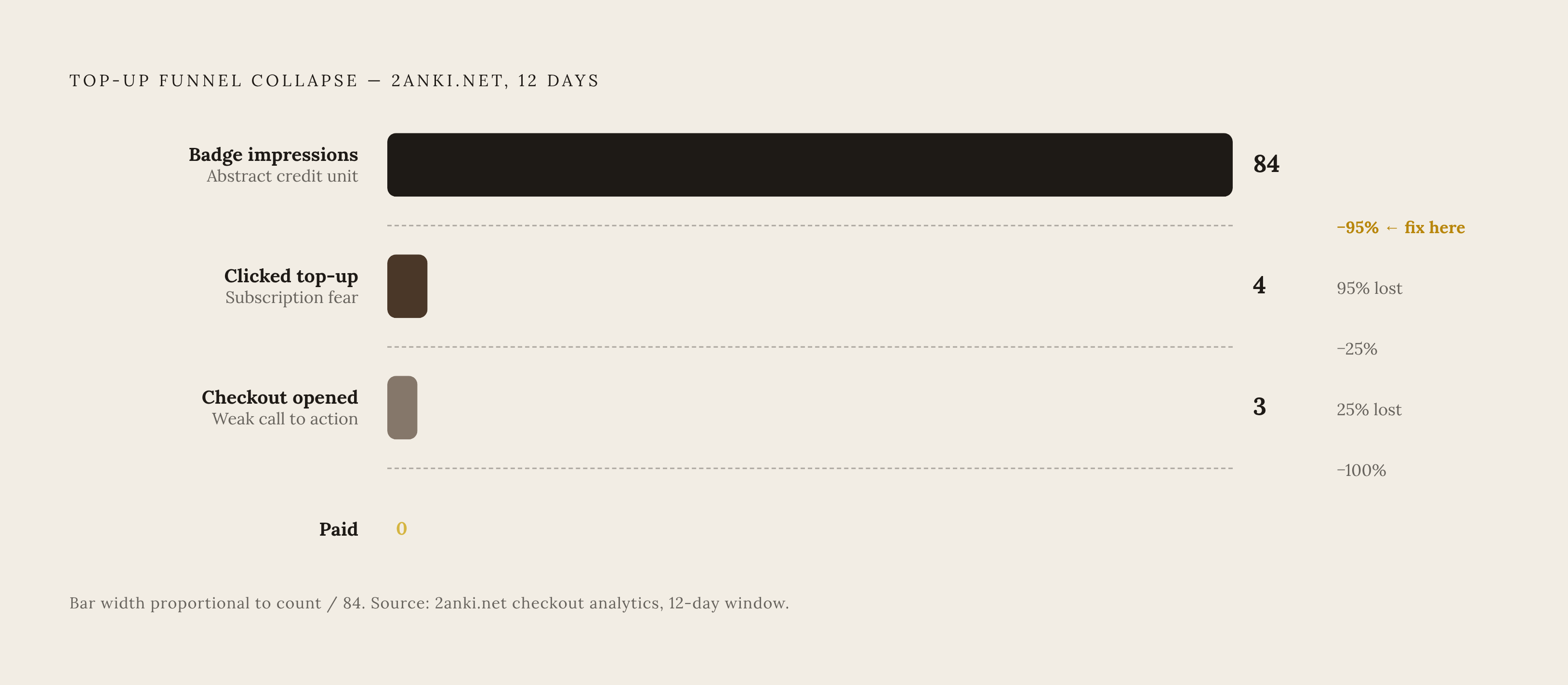
Top-up conversion breaks down at three separate points, and each one happens before the customer ever reaches the payment form, so checkout conversion rate alone tells a misleading story if it's the only number a team is watching. The first failure is the abstract credit unit. A customer looking at "250 credits" for $5 has no easy way to connect that number to the outputs they actually care about. Making the purchase requires translating credits into tasks into value, and most customers abandon that translation partway through. The fix is to state the unit in task terms right at the point of purchase, something like "about 50 image generations" or "roughly 10 hours of agent time," rather than describing it in raw infrastructure terms the customer has no way to interpret.
The second failure is subscription fear. If a top-up prompt doesn't clearly separate a one-time purchase from a recurring charge, it triggers cancellation anxiety in customers who have been burned by unwanted subscriptions before. State the purchase type, "one-time, no auto-renewal," in the call-to-action button or directly next to it.
The third failure is a weak call to action that carries no sense of urgency. A generic "buy credits" button doesn't connect to the customer's actual situation, the specific piece of work sitting blocked right now because the balance ran out. Contextual, in-product triggers tied to the exact moment of a threshold event convert at a meaningfully higher rate than generic upgrade prompts. The fix is to make both the warning and the CTA reference what the customer can't currently do, not just how many credits are left in the account.
These three failures compound. An abstract unit, combined with a prompt that reads like a trap, combined with no urgency, produces close to zero conversion even among customers who would genuinely be willing to pay if the flow simply asked them properly.
Setting warning thresholds that trigger intent rather than anxiety
A warning threshold functions as a conversion parameter, not a notification setting, and getting it right depends on understanding how a given customer actually consumes credits, not just how many they have left. Consumption rates vary enormously: a customer running a conversational agent heavily might hit a low-balance state within days, while a light user might not see one for weeks. A single static rule, like "warn at 20% remaining," treats both customers identically and gets the timing wrong for both. A threshold tied to usage velocity, one that fires when the remaining balance represents fewer than some number of days of usage at the customer's current rate, triggers at a point that's actually relevant to that customer's situation.
Timing relative to a blocking event matters just as much as the threshold level itself. If a warning fires while the customer can still finish what they're working on, it reads as a helpful heads-up. One that fires only after the work is already blocked reads as a frustration. So designing for the first case means knowing, at the feature level, which actions consume credits quickly, and surfacing the warning before those actions start.
Sequencing multiple thresholds outperforms relying on a single warning. Real-time visibility into balance helps too: a customer who can watch consumption happen as they work builds an accurate mental model of their own usage, so that when a warning does arrive, it lands as credible information. This kind of design depends on metering infrastructure that can take in usage events as they happen and update the balance immediately; a system that only updates once a day can't support velocity-aware thresholds or in-the-moment visibility.
Messaging experiments that turn a low-balance state into a top-up decision
Whether a customer reads a low-balance state as something to fix or something to resent depends on how the warning message is framed, and that mostly comes down to whether the message connects the remaining balance to value the customer still wants. Leading with loss, "you're almost out of credits," without immediately offering a way forward, tends to activate worry. So the customer's first instinct becomes questioning whether the product is worth continuing. An alternative approach leads with what the customer has already gotten out of the product and what they stand to keep doing: "you've generated 40 outputs this month, add credits to keep going."
Specific language tends to outperform vague language. A message that names the task currently in progress, "your image generation is paused, add 100 credits to continue," resolves the question actually on the customer's mind right then, whether the task at hand can still be finished, rather than prompting a bigger, slower question about whether the whole product is worth paying for. This is the same contextual-trigger logic that applies to thresholds: a message tied to the exact moment of need converts better than a generic balance alert.
Test a few copy variants in sequence rather than all at once, so each result can be read cleanly: balance-first copy ("42 credits remaining") against task-translation copy ("enough for about 8 more generations"); a loss frame ("you're running low") against a continuation frame ("keep editing your project"); and a single flat top-up offer against an anchored set of three tiers with the middle one highlighted as the default. A short line next to the CTA, "one-time purchase, no auto-renewal," speaks directly to the flaw 2anki's team identified as a conversion killer regardless of traffic volume. Urgency should come from the customer's actual situation, blocked work, an approaching deadline, a project mid-flight, rather than from manufactured scarcity or fake countdown timers, which tend to destroy trust the moment a customer notices the "limited-time" offer was never actually limited.
Designing the top-up flow so checkout does not undo the warning's conversion work
A customer who clicks through a well-built warning and a credible message has already made the real decision to buy. At that point, checkout's only job is to execute the purchase without getting in the way, and any friction introduced at this stage throws away conversion that was already won upstream. In the 2anki experiment, three checkout sessions all expired unpaid with no payment attempt and no card decline, a pattern that points to customers stalling out before they ever get to the point of entering a card number. That means the design priority for a top-up flow is minimizing the distance between the warning and a completed payment, not simply minimizing the number of fields on the payment form itself.
If checkout stays inside the product, rather than sending the customer off to an external payment page, it avoids a context switch that gives the customer a chance to second-guess the purchase. Tier labels described in task terms, light use, regular use, heavy use, work better than raw credit counts alone.
Once the purchase goes through, the confirmation screen should return the customer straight back to the task that was blocked, with a clear signal that the balance has been restored. A platform built on prepaid credit wallets that updates in real time makes the "you can continue now" message trustworthy the instant it appears; a system that only reconciles balances on a batch schedule can't deliver that moment convincingly, and the gap between payment and restored access becomes its own source of doubt.
Running warning experiments as a continuous pricing lever, not a one-time setup
Warning thresholds, top-up tier sizes, and message variants are pricing decisions, so like any pricing decision they work best when a team can keep adjusting them. The gate-and-review approach 2anki's team used, a fixed checkpoint at 15 sessions or October 20, 2026, with a clear keep-or-drop decision at that point, offers a disciplined way to run an experiment like this at low traffic. The same principle generalizes beyond this one case: any warning experiment needs a gate condition set in advance, based on a minimum number of real sessions rather than impressions, along with a decision rule agreed on before the results come in.
The changes that matter most at this layer, threshold levels, tier sizes, copy variants, where the CTA sits, should be things product and growth teams can adjust directly, without waiting on an engineering release. A monetization system that gives engineering, product, and finance a shared view of the same usage and billing data, without each team having to request it from the others, is what turns a warning experiment into an actual pricing decision.
Some teams worry that changing warning behavior often will unsettle customers who notice the shifts. Treating the warning system as a fixed feature, shipped once and left alone, throws away one of the few moments in an AI product where a customer's intent to pay is already established and just waiting to be met with the right message at the right time.